anscombe
Anscombe’s quartet: similar statistics, different patterns
Eleven (x,y) pairs of numbers, with means x̄=9.0 and ȳ=7.5, and identical linear regression lines (same slope and intercept) and correlation coefficients (approximately 0.816). When plotted, reveals starkly different patterns: one shows a linear relationship, another a non-linear curve, the third a near-perfect linear relationship disrupted by a single outlier, and the fourth a near-vertical line of points where a single outlier entirely dictates the regression.
In his 1973 paper "Graphs in Statistical Analysis" Yale Professor Francis Anscombe uses these four datasets to argue that visualization is essential to good statistical work, not merely an optional supplement. This was a radical position at a time when most statistical analysis was done through batch processing on mainframes with no graphical output. Serves as a powerful demonstration that identical summary statistics can mask radically different patterns in data, making the case that statistical analysis should combine both numerical calculations and graphical examination.
Fields
| Field | Type | Distribution | Summary | Missing |
|---|---|---|---|---|
SeriesAdd a description for Series | string | 4 distinct | I 11 · II 11 · III 11 | Missing 0 |
XAdd a description for X | integer | 4 – 19 · mean 9 | Missing 0 | |
YAdd a description for Y | number | 3.1 – 12.74 · mean 7.5 | Missing 0 |
Profiled across all 44 rows. No field descriptions yet. Add them
Explore
Preview
| Series | X | Y |
|---|---|---|
| I | 10.0 | 8.04 |
| I | 8.0 | 6.95 |
| I | 13.0 | 7.58 |
| I | 9.0 | 8.81 |
| I | 11.0 | 8.33 |
Examples
-
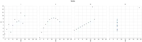 Trellis Scatter Plot Showing Anscombe's Quartet Open in Vega Editor
 -
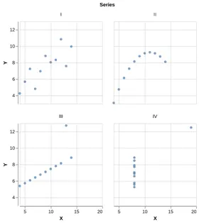 Anscombe's Quartet Python Source
Vega and Vega-Lite examples open in the Editor with this dataset loaded. Altair examples link to their Python source.
Provenance
- Source
- License
-
Not specified. Check the source's terms before reuse.
- File
data/anscombe.json· 1,703 bytes · View on GitHub