driving
U.S. driving distances and gasoline prices
Tracks the relationship between driving habits and gasoline prices in the United States during a period spanning multiple significant events, including the cheap gas era, Arab oil embargo, energy crisis, record low prices, and the "swing backward" from 1956 to 2010.
Fields
| Field | Type | Distribution | Summary | Missing |
|---|---|---|---|---|
sideLabel positioning indicator used in the original visualization to optimize readability and prevent overlap | string | 4 distinct | right 19 · bottom 17 · left 12 | Missing 0 |
yearYear of observation from 1956 to 2010 | integer | 1,956 – 2,010 · mean 1,983 | Missing 0 | |
milesMiles driven per capita per year, ranging from approximately 4,000 to 10,000 miles | integer | 3,675 – 10,070 · mean 7,165 | Missing 0 | |
gasPrice of a gallon of regular grade gasoline, adjusted for inflation | number | 1.39 – 3.31 · mean 2.17 | Missing 0 |
Profiled across all 55 rows.
Explore
Preview
| side | year | miles | gas |
|---|---|---|---|
| left | 1956 | 3675 | 2.38 |
| right | 1957 | 3706 | 2.4 |
| bottom | 1958 | 3766 | 2.26 |
| top | 1959 | 3905 | 2.31 |
| right | 1960 | 3935 | 2.27 |
Examples
-
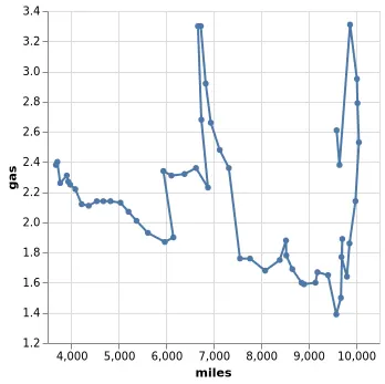 Connected Scatterplot (Lines with Custom Paths) Open in Vega Editor
 -
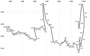 Connected Scatter Plot Open in Vega Editor
 -
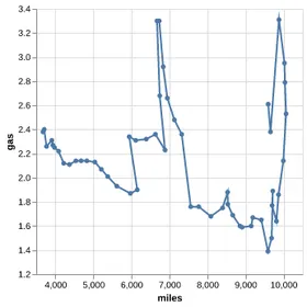 Line Chart with Custom Order Python Source
Vega and Vega-Lite examples open in the Editor with this dataset loaded. Altair examples link to their Python source.
Provenance
- Source
- License
-
Not specified. Check the source's terms before reuse.
- File
data/driving.json· 3,461 bytes · View on GitHub